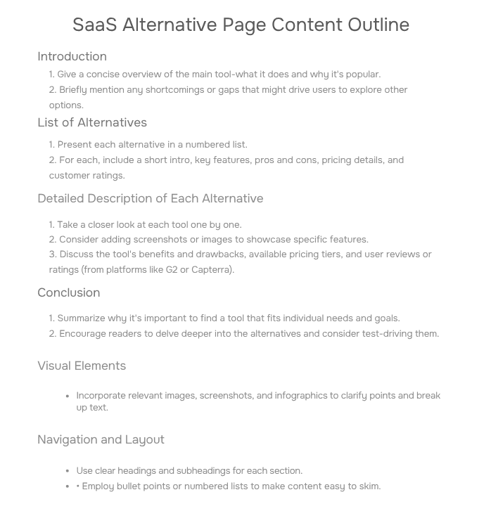
Must Have SaaS Landing Pages for Better AI Visibility

Table of Contents
ToggleIntroduction
According to a study by Precedence Research The global SaaS market grew to USD 358.33 billion in 2024 and is predicted to increase from USD 408.21 billion in 2025 to approximately USD 1,251.35 billion by 2034, expanding at a CAGR
The majority of SaaS websites still have conversion rates of about 2.35% despite this growth, which could lead to a sizable loss of revenue.
This guide is your guide if your conversion rate is 2.35% while your competitors’ is 20%.
Allow us to turn the more than $150 million in traffic you receive into real revenue growth.
Sneak peek: We’ll go over seven “money pages” that have been proven to convert the leads, three times better than typical features pages, as well as how to make them.
The Conversion Reality Check
- Industry Average: 2.35%
- Top Performers: 4–14% (some hit 20%!)
- Your Opportunity: A 5% jump that could 2x the revenue without more traffic.
What this blog adresses:
- What pages convert the best for SaaS?
- Why are certain “money pages” overlooked?
- How to create each with examples and proof?
- What pages convert the best for SaaS?
The Structure of an Effective SaaS Landing Page
(Follow This Flow)
1. Hero Section
- Hook: Benefit-driven headline combined with a clear value proposition.
- Visual: A picture or video that highlights the product (such as Grammarly’s tone detection demonstration).
- Pro Tip: Use photos that direct viewers’ attention to your call to action to increase conversions by 20%.
2. Features → Benefits
- Mention the top features of your product and how it will benefit the buyer. For example:
- Bad: “AI-Powered Analytics”
- Good: “Cut Reporting Time by 70%: AI Does the Heavy Lifting.”
3. Social Proof
- After describing the value proposition, place testimonials in the middle of the page to foster trust.
- For instance, Clio’s 32 product pages generate 152K visits annually, resulting in 1,500+ customers at a mere 1% CR.
4. Social Proof
- Primary Call to Action: Vibrant color, action-focused (“Start Free Trial”).
- Secondary CTAs: Less demanding (like “Download Pricing Guide”).
→ Interactive Tool: Analyze your hero section (Upload a screenshot for instant feedback).
The pages that are most important
Here are the seven pages that play a vital role in the buyer’s journey and are crucial for any and all saas companies.
Alternatives Page:
Rank for “[Competitor] Alternatives” (27K+/mo searches)
Reddit Threads / Subreddit
Fuel 71% of buying journeys (10K+ visits from Reddit)
Migration Pages
Capture switchers (3X conversion rate)
Comparison Pages
Convert “vs.” battlegrounds (12-20% lift)
Feature Pages
Answer “How does [X] solve [Y]?” (152K visits/page)
Solution page
Features impress, but solutions convert.
Course page
Build trust by teaching—not pitching
1. Alternative Pages: Your Shortcut to Stealing Market Share (Ethically)
Purpose: Show up when users are ready to ditch the competition and win the conversion.
Why Alternative Pages Work
Let’s break it down with a little logic:
If someone types into Google:
- “DocuSign Alternatives” – 4,800+ searches/month
- “Basecamp Alternatives” – 3,300+/mo
- “Wix Alternatives” – 3,900+/mo
- “QuickBooks Alternatives” – 6,200+/mo
- “Zendesk Alternatives” – 7,100+/mo
- “DocuSign Alternatives” – 4,800+ searches/month
…they’re not at the beginning of their journey. They’re not asking what a CRM is or wondering how e-signatures work. They already know.
They’ve tried the tool.
They’ve hit a wall.
And now, they’re actively looking for something better, or in some cases cheaper.
That’s bottom-of-funnel intent in plain sight. You won’t find a clearer buying signal than this.
People searching like this are done settling. If you’ve got a better answer to their problem, now’s your shot to show up and win them over.
You may ask ‘How?’, the simple answer would be by pitching them with pages that offer a different angle of value, such as “Notion alternatives” or “Top tools for remote teams”.
Imagine a frustrated small business owner trying to rebuild their website. They want something:
- More flexible
- Less clunky
- With better SEO
- More flexible
If your product solves those exact problems, an alternative page can walk them through:
- Why other teams switched
- What pain points does your tool solve better?
- How to get started (fast + risk-free
- Why other teams switched
Examples
- Let’s take “Wix Alternatives” (3,900+/mo).
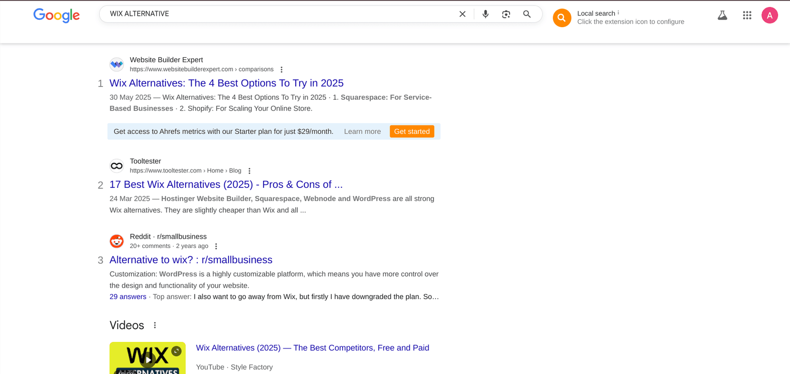
In this search, you’re not competing against 20 other tools, you’re competing with Wix. That’s a battle you can prepare for, by pin-pointed answers like ‘Why your offering is better than WIX’s’, or ‘Why you provide a 5x better value than Wix’.
Pro Tip: Use tools like Hotjar or Microsoft Clarity to measure how users interact with your comparison tables, and A/B test benefit-led CTAs like:
- “See Why Teams Choose Us Over [Competitor]”
- “Switch in Minutes No Data Loss”
- “See Why Teams Choose Us Over [Competitor]”
2. Reddit Threads / Subreddit / Id as an Organic Channel (User-Generated SEO Goldmine)
I know that this might not technically be a page, but SaaS businesses must exist on Reddit and other such platforms, from both an SEO and a GEO standpoint. More than just a discussion site, Reddit is a high-visibility, high-trust content engine that clever SaaS companies are covertly using.
Reddit has become a key source of training data for large language models, thanks to its rich, real-world conversations. Major players like Google and OpenAI have reportedly signed licensing deals worth $60–$70 million to access Reddit’s content, highlighting just how valuable a strong presence on the platform can be for brand visibility in the AI ecosystem.
Start by answering the legitimate Google searches that your users are already making. Include nuanced, useful examples; make sure they feel valued rather than targeted. Talk about your services on a platform like Reddit, but make sure not to start promoting them like you normally do. Slip a mention of your product and how it is better. Reddit has very strict policies regarding promotional content.
If you do it right, you will get steady organic traffic without spending any money on advertising.
By employing the appropriate structure and understanding search intent, these pages will be indexed quickly and continue to benefit you long after their publication.
These Reddit threads often act like landing pages, ranking on Google for long-tail keywords.
Real Example from Zapier
Zapier has a strong Reddit presence, not through ads, but through community value.

One top-performing thread discussing “Best productivity hacks with automation” mentions Zapier and drives:
10,000+ organic monthly visits, Rankings for high-intent keywords
Multiple upvotes on branded mentions
This traffic wasn’t paid for; it was earned through relevance and community trust.
3 Software Migration Pages
Let’s be honest, switching software is stressful. That’s exactly why Migration Pages work. They’re built for users who’ve hit their breaking point with another platform… and just need a smooth way out.
Think of it as the digital equivalent of saying: “We’ve got you. You won’t lose a thing.”
Some headline examples that stop the scroll:
- “Migrate from Salesforce to [Your CRM] in 7 Days! Zero Downtime”
- “Switch from Shopify to [Your Ecom Platform]! We’ll Do It For You”
- “Goodbye QuickBooks, Hello [Your Accounting Tool]”
- “Migrate from Salesforce to [Your CRM] in 7 Days! Zero Downtime”
Why It Works
These users already know what they don’t want.
They’re:
- Fed up with limitations
- Actively looking for a smoother experience
- Worried about the cost and effort of switching
- Fed up with limitations
So instead of pitching features, your Migration Page should say:
“We get it. Let’s make this painless.”
SaaS companies that invest in these pages often see 3X higher conversion rates compared to traditional product pages.
Why? Because they remove the biggest obstacle: fear of change.
Real Example: FreshBooks’ Migration Page in Action
FreshBooks highlights migration from QuickBooks with:
- Clean side-by-side comparison
- Dedicated setup concierge
- Bonus: “Switching bonus” for new customers
- Clean side-by-side comparison
It’s the perfect example of a migration page that meets the user where they are—and pulls them across the finish line.
Do You Know What ChatGPT is Saying about Your Brand?
Don’t wait for a crisis. Proactively manage your brand’s reputation in the age of AI. To learn what AI is saying about you, book 1:1 Meeting with the #1 GEO Expert in the world.
4. Comparison Pages: Win Where Buyers Are Stuck Between Two Choices
Let’s be real: most SaaS companies hate the idea of comparison pages. It’s uncomfortable. It feels like you’re picking a fight.
So internal teams push back with arguments like:
“Why would we highlight competitors on our site?”
“What if we look bad?”
“Isn’t it risky to mention them by name?”
Here’s the thing: Your customers are already doing it.
They’re searching:
- “Salesforce vs HubSpot”
- “ClickUp vs Trello”
- “Slack vs Teams”
They want answers. And if you don’t give them one, Google will, probably with content from a competitor, an affiliate blog, or a review site that doesn’t tell your side of the story. That’s why we always say:
Comparison pages are direct head-to-head landing pages that pit your product against a specific competitor.
Think:
- Slack vs Microsoft Teams → 6,600 searches/month
- ClickUp vs Trello → 880/month
- Salesforce vs HubSpot → 1,900/month
- Slack vs Microsoft Teams → 6,600 searches/month
These pages attract buyers who are:
- Evaluating two tools side-by-side
- Deep into the decision-making process
- Actively looking for clarity and confidence before converting
- Evaluating two tools side-by-side
Intercom’s “vs” comparison pages see a 12–20% higher conversion rate than their homepage. That’s because comparison pages meet users at a critical moment. They don’t need to be sold on the category; they need help choosing the right tool.
ClickUp’s Comparison Pages in Action
- Side-by-side comparisons with top competitors like Asana, Trello, ClickUp, Wrike, and others

- Clear value proposition: They highlight what they do better without bashing the competitor
- Use of visuals, feature tables, and customer quotes
- Clear value proposition: They highlight what they do better without bashing the competitor
Result:
These pages rank for high-intent searches like “Trello vs Monday” and capture users actively looking to make a decision.
5. Feature Pages: Translate Functionality Into Buyer Confidence
Feature Pages are like dedicated landing pages that dive deep into one specific feature of your product.
Think of them as the answer to the question, your prospective client is already Googling:
“How does [Product Name] help with [specific problem]?” They’re not just about listing functionality, they’re about connecting features to outcomes.
When done right, a well-optimized feature page can act like a mini-homepage for a specific problem. Let’s look at the numbers: How Grammarly’s Feature Pages Work (Without You Even Noticing)
Grammarly doesn’t just rely on its homepage or Chrome store listing. It’s quietly dominating organic traffic with feature-specific landing pages built around real-world use cases.
Let’s look at one:
“Tone Detection” – A single feature page explaining how Grammarly helps you sound more confident, friendlier, or more professional in your writing.
Breakdown (Real Performance)
| Metric | Data |
|---|---|
| Organic traffic to the “Tone Detector” page | ~7,300+ visits/month |
| Conversion estimate (1.2%) | ~87 new users/month |
| Ranking keywords | “email tone checker”, “how to sound more professional”, “grammarly tone” |
Why It Converts: It’s Built for Humans
This isn’t just a landing page; it’s a mini experience. You can drop in your text and instantly see tone feedback. Hover over words to explore how “curious” sounds vs “assertive.” Want it tailored? Just pick a use case, like a work email or student project and it adapts. Over 600 million corrections this month?
That stat builds trust fast. And the soft CTA?
6. Solution Page: Speak to the People, Not Just the Product
While feature pages show what your tool does, solution pages show who it helps and why it matters.
Most SaaS sites talk about themselves. Solution pages flip that. They talk to the user about their world, their pain, and their goals. They bridge the gap between product capabilities and real-world outcomes, tailored to a specific industry, job role, or problem.
See It in Action: A Solution Page That Gets the User
Here’s a real example from HubSpot that nails what a great solution page looks like.
- It speaks to the user’s exact role
- Shows real use cases, not just features
- Feels helpful—not pushy
- It speaks to the user’s exact role
Tip: Pay attention to how the content adapts based on who the visitor is. That’s the key to relevance and conversions.
7. Course Page: Share Your Smarts, Scale Your Impact
Let me be real with you, most people don’t read manuals. But if you show them how your product works, in a way that feels helpful (not salesy), they’ll stick around. That’s exactly why course pages are underrated conversion machines.
I’ve seen SaaS companies turn a simple 3-part course into an onboarding engine, a trust-builder, and in some cases, a community magnet. More SaaS brands are discovering this: teaching your product is one of the best ways to sell it. That’s where interactive course pages come in.
These aren’t just “video libraries”, they’re structured learning hubs that:
- Show the product in action
- Transfer know-how
- Build user confidence
- Reduce churn and yes—increase conversions
Why They Work
- People trust brands that teach, not just pitch
- Course content builds onboarding velocity and product stickiness
- You create a value loop: Learn → Try → Win → Share
- People trust brands that teach, not just pitch
AI Monitor Course Page
The great course page isn’t just content. It’s a soft onboarding engine that builds trust, boosts retention, and reduces churn before someone even signs up.
8 Add-On: FAQ + CTA Placement Guide
Purpose: Increase SEO and GEO value + reduce friction
Most SaaS pages bury answers in blog posts or help docs. Smart brands bake FAQs right into their high-intent pages and pair them with CTAs when buyers are most ready.
Best Practices
- Adds keyword-rich content → boosts SEO
- Handles last-minute objections → boosts conversions
- Keeps users on-page longer → builds trust
- Adds keyword-rich content → boosts SEO
Example:
- Each key page should end with:
- 3–5 FAQs (based on “People Also Ask” queries)
- Clear CTA (try free, demo, calculator)
- 3–5 FAQs (based on “People Also Ask” queries)
Tip: Use schema markup (FAQSchema) to make your FAQs appear directly in Google search results → higher CTRs without paid ads.
Good FAQs = free traffic.
Great FAQs = free traffic and more signups.
. Pages with FAQ + reviews section = 25% higher average time on site
Conclusion: Don’t Wait — Build Money Pages Now!
Traffic means nothing if your pages can’t convert.
Start with the essentials:
- Alternative Pages for Switchers
- Comparison Pages for decision-makers
- Migration Pages for easy onboarding
- Feature & Solution Pages that speak to real problems
- Course Pages to build trust
- Reddit & FAQ Add-ons for organic SEO and GEO wins
These aren’t optional, they’re your growth engine. You have reviewed the blueprint; now it is time to take action.
Your competitors are appearing on Google, providing buyers with genuine answers, and converting traffic that could have been yours. These “money pages” not only capture attention, they also prompt action.
Whether it is a frustrated user searching for “X’s alternative,” a decision-maker evaluating tools, or a new lead eager to learn through a course. You must be present, with a page specifically designed for them. Do not merely increase traffic; transform it into actual revenue.
Frequently Asked Questions:
What are the most effective SaaS landing pages for conversions?
The most effective SaaS landing pages are those designed for specific buyer intents, such as Alternatives Pages, Comparison Pages, Migration Pages, Feature Pages, and Solution Pages. These "money pages" target users at the bottom of the funnel and can convert 2 to 3 times better than general product or pricing pages.
Why do “Alternative” pages convert better than standard product pages?
Because visitors searching for “[Tool] alternatives” already know what they want, they are unhappy with a competitor and ready to change. These users have bottom-of-funnel intent, which makes them very likely to convert with the right positioning.
How can Reddit threads help my SaaS business grow organically?
Reddit threads frequently show up on Google for long-tail, intent-driven queries. By participating genuinely in relevant subreddits and casually mentioning your product, you can build trust, improve SEO visibility, and attract steady, unpaid traffic.
What should a SaaS migration page include?
A migration page should make the process easier by tackling issues like downtime, data loss, and complicated onboarding. Use clear benefit-focused calls to action, step-by-step comparisons, testimonials from those who have made the switch, and even setup bonuses to increase conversions.
Are comparison pages risky for my brand?
Not if done right. Comparison pages provide buyers with clarity when choosing between two tools. If you don't create them, affiliates and competitors will, and you'll miss the opportunity to highlight your strengths. The best brands succeed in this area by being honest, organized, and focused on value.
How do feature pages differ from solution pages?
Feature pages focus on specific functions, detailing what the tool does. Solution pages show how those features address real-world problems for various user roles or industries, explaining why it is important. Both are critical for supporting different stages of the buyer's journey.
Can a free course really improve SaaS signups?
Yes, course pages build trust and show prospects how to get value from your tool before they commit. They serve as a gentle introduction and help reduce churn by boosting product confidence. Additionally, educational content usually performs well in search results and is often shared.
What are “money pages” in SaaS marketing?
“Money pages” are focused web pages that aim to meet specific search needs, such as finding alternatives, making comparisons, or switching tools. They typically convert three to five times better than regular marketing pages because they connect with users at the right stage of their buying journey.
How do I structure a high-converting SaaS landing page?
Start with a hero section that highlights the benefits. Present a clear value proposition and use visuals that guide attention to the CTAs. Follow this with benefits, social proof, and interactive elements. Finish with a strong call to action and relevant FAQs to address concerns and increase time on the site.
What’s the fastest way to increase SaaS conversions without more traffic?
Optimize your existing traffic with pages that convert better. Adding just 2 or 3 of the right “money pages” can double your conversions. Focus first on alternative and comparison pages. They provide the biggest boost with the clearest buyer signals.